How to Combine Colors in Your Interior Design: Mastering the 60-30-10 Rule
Color has the power to transform a room—from sterile to serene, from dull to dynamic. But navigating the world of color in interior design can feel overwhelming. If you’ve ever hesitated at a paint swatch or second-guessed a sofa’s shade, you’re not alone.
Thankfully, there’s a timeless principle that simplifies the process: the 60-30-10 rule. When paired with a deeper understanding of color schemes and psychological nuance, it becomes your blueprint for creating visually balanced and emotionally resonant interiors.
What Is the 60-30-10 Rule?
This foundational design rule allocates your color palette as follows:
60% Dominant Color
This is your base. It covers the largest area—think walls, large rugs, or major furniture pieces. It sets the general tone of the space.
30% Secondary Color
This complements the dominant hue and supports visual interest. You’ll see it in upholstery, curtains, smaller furnishings, or accent walls.
10% Accent Color
This is your pop—bold, daring, or contrasting. You’ll find it in artwork, throw pillows, vases, or other small details that bring energy and tension.
The beauty of this rule lies in its flexibility. It works with any style, from minimalist Scandinavian to maximalist boho.
Choosing a Color Scheme: Monochromatic vs. Complementary
To apply the 60-30-10 rule effectively, you must first choose a color palette. The safest and most sophisticated approaches are:
1. Monochromatic Scheme
This involves varying tones and shades of a single hue. For example, using deep navy (60%), sky blue (30%), and pale baby blue (10%).
Pros:
Visually soothing and easy to coordinate
Ideal for minimalist or modern styles
Evokes sophistication and unity
Pro Tip: Play with textures—matte vs. gloss, linen vs. velvet—to avoid visual monotony.
2. Complementary Scheme
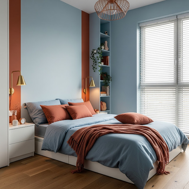
Uses colors opposite each other on the color wheel (like blue and orange). One becomes dominant; the other is accent.
Pros:
High contrast and dynamic
Great for statement interiors
Perfect for bold personalities
Pro Tip: Temper complementary pairings with a neutral dominant (like warm gray or white) to avoid overwhelming intensity.
Advanced Tips & Tricks for Color Harmony
🖼️ 1. Let Nature Inspire Your Palette
Borrow from organic scenes—forest greens, clay browns, sky blues. Nature has already balanced these tones beautifully.
Try: A terracotta dominant (60%), olive green secondary (30%), and sky blue accents (10%).
🎨 2. Use Neutrals as Anchors
Not every color in your scheme needs to scream for attention. Warm whites, grays, and beiges create breathing room in vibrant spaces.
Example: In a coral-and-teal complementary scheme, a soft greige wall can serve as the 60%.
🌗 3. Play with Temperature
Cool colors (blues, greens, purples) recede; warm colors (reds, yellows, oranges) advance. Use this to shape spatial perception.
Design Hack: Want a small room to feel larger? Use a cool dominant and warm accents to subtly push the walls back.
🧠 4. Respect Color Psychology
Colors evoke emotions. Choose according to the room's function.
| Room | Ideal Colors | Why |
| Bedroom | Soft blues, lavenders, warm taupes | Promotes relaxation |
| Kitchen | Whites, yellows, greens | Boosts freshness and appetite |
| Home Office | Deep blues, forest greens | Encourages focus and calm |
| Living Room | Earth tones, sage, rust | Invites warmth and conversation |
🖌️ 5. Don't Fear the 10%
That accent color is your space's signature. Metallics, neon, jewel tones—this is where your personality shines.
Try: In a soft ivory and sage room, add mustard velvet pillows or a brass pendant light.
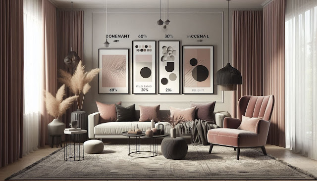
Real-World Example: A Balanced Living Room
Let’s build a living room using the 60-30-10 method:
60% Dominant: Light stone gray walls and rug
30% Secondary: Dusty rose curtains, velvet armchair, and ottoman
10% Accent: Matte black fixtures, ceramic vases, and framed abstract art in black and blush
The result? A modern yet cozy space that feels cohesive, with subtle drama.
Color Is a Dialogue
Combining colors in interior design isn't just about aesthetics—it's about storytelling. Each color you choose contributes to the narrative of your home: how it feels, how it functions, and how it reflects you.
By applying the 60-30-10 rule and understanding the emotional and visual interplay of color, you gain the power to create interiors that are not only beautiful—but deeply personal.
Bonus: Quick Tips Cheat Sheet
✅ Start with a neutral base to avoid clashing
✅ Use the 60-30-10 rule to maintain visual balance
✅ Stick to 2–3 core colors to prevent chaos
✅ Use texture and sheen to add depth within monochromatic schemes
✅ Rotate accent colors seasonally for a fresh look without a full redesign
Need help picking your palette? Drop a photo of your space or describe your favorite colors—I’ll help you design your dream interior!


Comments
Post a Comment